Scrolling through my collections page on Instagram, one thing stands out among the rows and rows of mid-century modern furniture I can’t afford, dreamy outdoor dinner spreads, and every photo ever posted by Simon Porte Jacquemus: Primary and secondary colors are taking over in fashion.
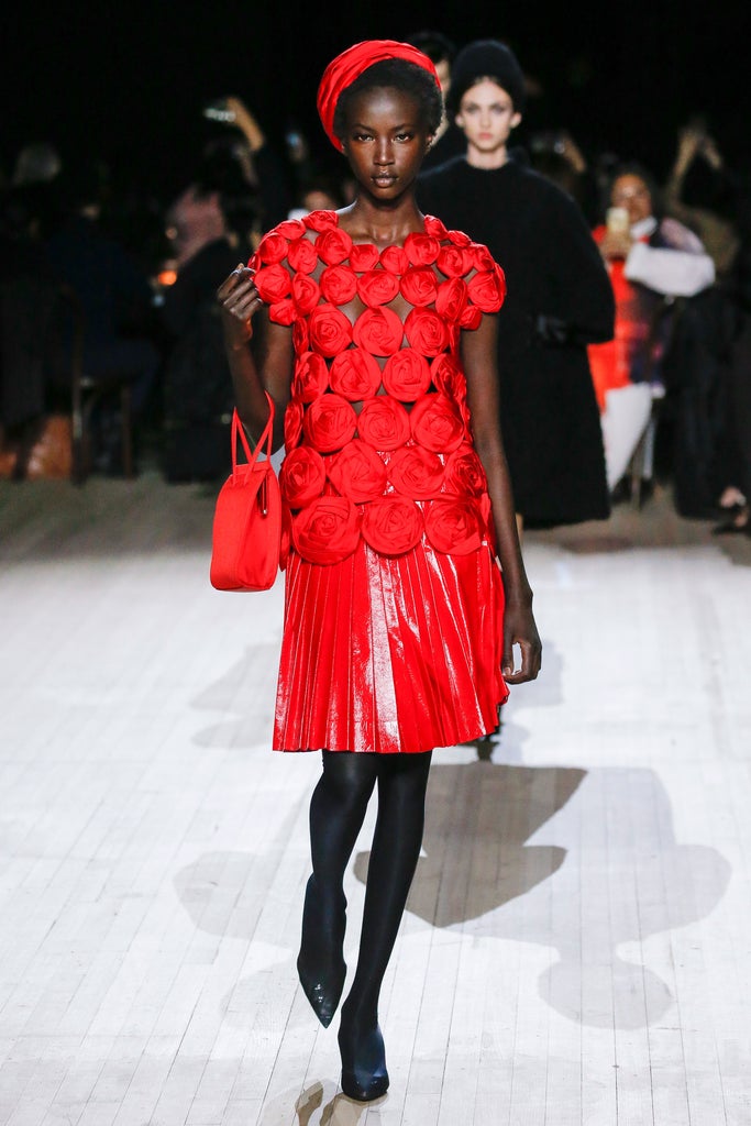
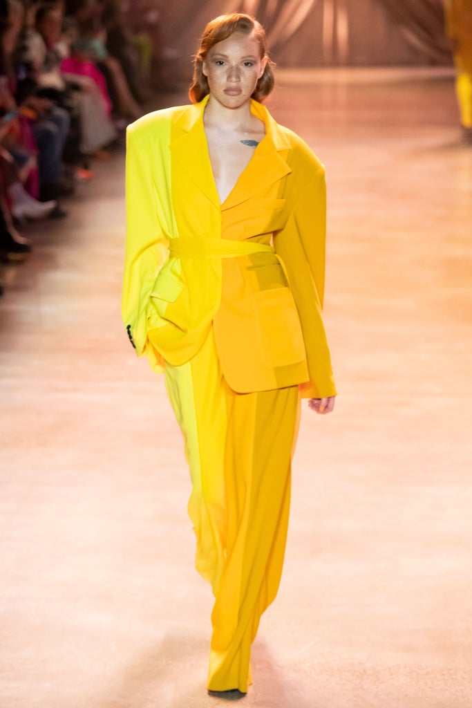
During fall ‘20 New York Fashion Week, designers like Christopher John Rogers, Proenza Schouler, and Sies Marjan all brought reimagined shades of blue, red, and yellow to their runways. Fellow NY-based label Hellessy incorporated kelly green, a secondary color, into its jewel-toned fall collection, while bicoastal indie brand Eckhaus Latta featured tangerine orange. The streets outside of shows were equally as back-to-basics in their color palettes, with attendees packing on layers of fire engine red, margarine yellow, and Pantone’s color of the year, Classic Blue, thanks to luxury brands like Loewe, Marni, The Row, and Bottega Veneta.


In the months since Marc Jacobs — who also happened to utilize the colors in his fall collection — closed out New York Fashion Week, a lot has changed. The pandemic that followed the city’s fashion week has affected nearly every aspect of the industry; Giants like J.Crew and Neiman Marcus filed for bankruptcy, while independent labels like Sies Marjan were forced to shut down. Yet, one thing in fashion has prevailed: the rising popularity of primary and secondary colors.
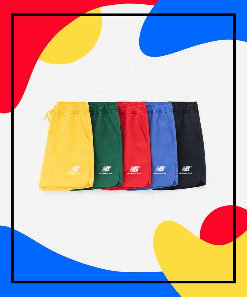
If anything, varying shades of red, blue, and yellow — as well as the secondary colors they become when mixed together — have garnered even more acclaim since the start of COVID-19, with streetwear brands like Aimé Leon Dore and Noah offering up track shorts, baseball caps, colorblocked button-downs, and other at-home sartorial favorites, all in the standard colors of the rainbow. ALD’s latest collaboration with New Balance is an ode to red, blue, yellow, and green.
The color trend goes hand-in-hand with the resurgence of ‘90s sportswear, which notably featured pieces like nylon anoraks, logo-embossed crewnecks, and bike shorts à la Princess Diana. In fact, Copenhagen-based brand Martin Asbjørn recently introduced a retro-inspired sportswear collection of monochrome sweatsuits in red, blue, purple, and green that are perfect for the kind of laidback fashion we’ve grown accustomed to in quarantine.
Demna Gvasalia brought a range of red, blue, green, and orange pieces to his resort ‘21 collection for Balenciaga that took place earlier this month — though Gvasalia has championed the hues for quite some time now. His spring ‘20 collection was also ripe with reds, blues, and greens, culminating in two larger-than-life ball gowns, one in bright red and the other in electric blue. Yes, both were meme’d in equal volume.
The campaign that followed, which was released in February of this year, was a political one, with imagery shot by photographer Laurence Chaperon and slogans that read, “Love Is For Everyone,” “We Vote For Tomorrow,” and “Think Big.” The background of the campaign was a shade of blue, while a BLCG logo in the upper righthand corner of every shot was painted red. At that point, the 2020 presidential election was coming, but not yet truly upon us. Now, however, as we see these two primary colors taking over fashion, the election is closer than ever. Coincidence? Who knows?
What some might not know is that all of the primary and secondary colors play a role in politics, too. Green represents the grassroots party in the U.S., a party that centers around environmentalism, among other things. Meanwhile, purple symbolizes the monarchy and yellow is a symbol for the libertarian party. With that in mind, it’s interesting that all of the shades are resurfacing right now.
During the current state of political and social instability, consumers are also looking for safety and serenity, something that primary and secondary shades are known to provide. Classic Blue, in fact, was chosen as the color of the year for its calming effect, according to Pantone’s website, which states that the “enduring blue hue highlights our desire for a dependable and stable foundation on which to build as we cross the threshold into a new era.” Furthermore, “Classic Blue brings a sense of peace and tranquility to the human spirit, offering refuge,” the website says.
Pantone’s fall ‘20 NYFW color palette also included Ultramarine Green, which “exudes self-assurance and poise;” Amberglow, a traditional shade of orange, which “promotes self-confidence and creative self-expression”; and Green Sheen, a bold yellow, that represents rebellion, something we’re seeing a lot of as young people around the world fight for racial and LGBTQIA+ equality both on the streets and behind digital screens.
During times such as these, it’s easy to look at a trend as just a trend. Yet, when you look at ones like flame print or the return to ‘60s-era psychedelic patterns, it’s hard not to question whether there is a deeper meaning to them. Regardless, despite everything we’ve endured so far in 2020, there is a sense that a new dawn is coming, and when it arrives, we’ll be sure to welcome it in a fresh pair of ALD x NB 827s.
Like what you see? How about some more R29 goodness, right here?
from Refinery29 https://ift.tt/3fCSE0W
via IFTTT
